Prezify Your Information: Making Dynamic Infographics!
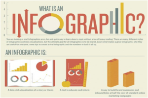
If there is one thing that can be described as a distinct aspect of the 21st century, it is the means of communication, especially visual communication. Infographics are one of the ways of presenting data or information visually. Infographics are all the rage in the field of online content marketing today. With many software and online applications enabling one to create beautiful and detailed infographics, it is no longer a domain of the Photoshop experts. However, there are a few ways in which your infographic can turn out to be non effective. These include anything from a cluttered presentation to poor spatial arrangement of data. Here are a few ways to avoid these mistakes, and to take your infographic to another level—by making them dynamic, using Prezi.
- Avoid Clutter
Information should not be crammed up into the tiny spaces in the infographic. It becomes difficult for the user to process it. Keep the information organised and compact, while leaving a lot of blank spaces. This ensures that the viewer does not get drowned in the information, and grasps the major points you want to put across.
- Proper Spatial Arrangement
This means that the information is arranged in such a way that the major points get more space, whereas the details occupy less space. This is how visual hierarchy is maintained. This helps the viewer to skim through the information with just one glance, without having to stop, to go into the details. Your viewers ought to be able to see the ‘big picture’ through just one glance. Spatial arrangement of data also involves the organising of ideas as per a visual structure, where one can easily see the connection between the various points.
- Prezify your Infographic
Prezi is a cloud based presentation software that helps one present ideas visually, using a zoom-able interface. It enables one to arrange information in a three dimensional canvas; and the zoom and pan features helps one to zoom into the details, while constantly stepping back to see the big picture. When a software like Prezi is used in combination with an infographic, what appears to be a static piece of information can be made more dynamic and full of depth. Here is an example of how Prezi can be used to enhance infographics:
http://prezi.com/veychlhwrdgz/putting-time-in-perspective/
One of the easiest ways to incorporate an infographic into a prezi is by starting with a minimalistic infographic that has only the main points and visuals that you want to present. This can be used as the canvas for the prezi, where finer details can then be added to the main points.
You can define a path for the movement from one point to another on your infographic. This is to help the viewer navigate through the infographic. Alternately, to avoid the linearity, you can choose to leave out the path, and let the basic structure of the infographic remain there. This way, the viewer can choose which points to read first.
Another way of making a dynamic infographic is to start directly with Prezi. Create an infographic the usual way, but now directly in Prezi, using the drag and drop method. Then add the path and animation feature, if required. Now you have a dynamic infographic!


